
Projects ⇢ EasyBits
Date
Enero - Julio 2025
Role
Product Designer & Web developer
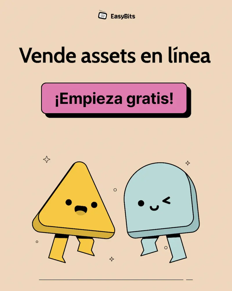
Easybits is a Saas platform that empowers independent creators to sell digital products with ease.
In EasyBits, creators can sell a wide range of downloadable assets — from books, images, and illustrations to 3D models, templates, mockups, code, or anything they create.
The platform not only allows users to sell their products, but also to customize the visual style of their website, set up a custom domain, securely store their files, and boost visibility by joining the EasyBits Community.
The objective of this project was to design an optimized, useful and user-friendly web application that provides a complete suite of services for creating and selling digital assets. The focus was on delivering a seamless experience that balances functionality, usability, and performance.
In this case study, I’ll walk through the full product design lifecycle — from user research and ideation to high-fidelity UI design and implementation — highlighting key decisions, challenges, and solutions throughout the process.
Defining the problem
Easybits' mission is to become the favorite and easier selling platform for digital creators. While there are international platforms available, they are not widely used by creators in Mexico. Are there unmet needs? Is the user experience truly satisfying? These questions led us to investigate more deeply. We set out to understand how current platforms align with real user needs — and where we could improve and stand out.
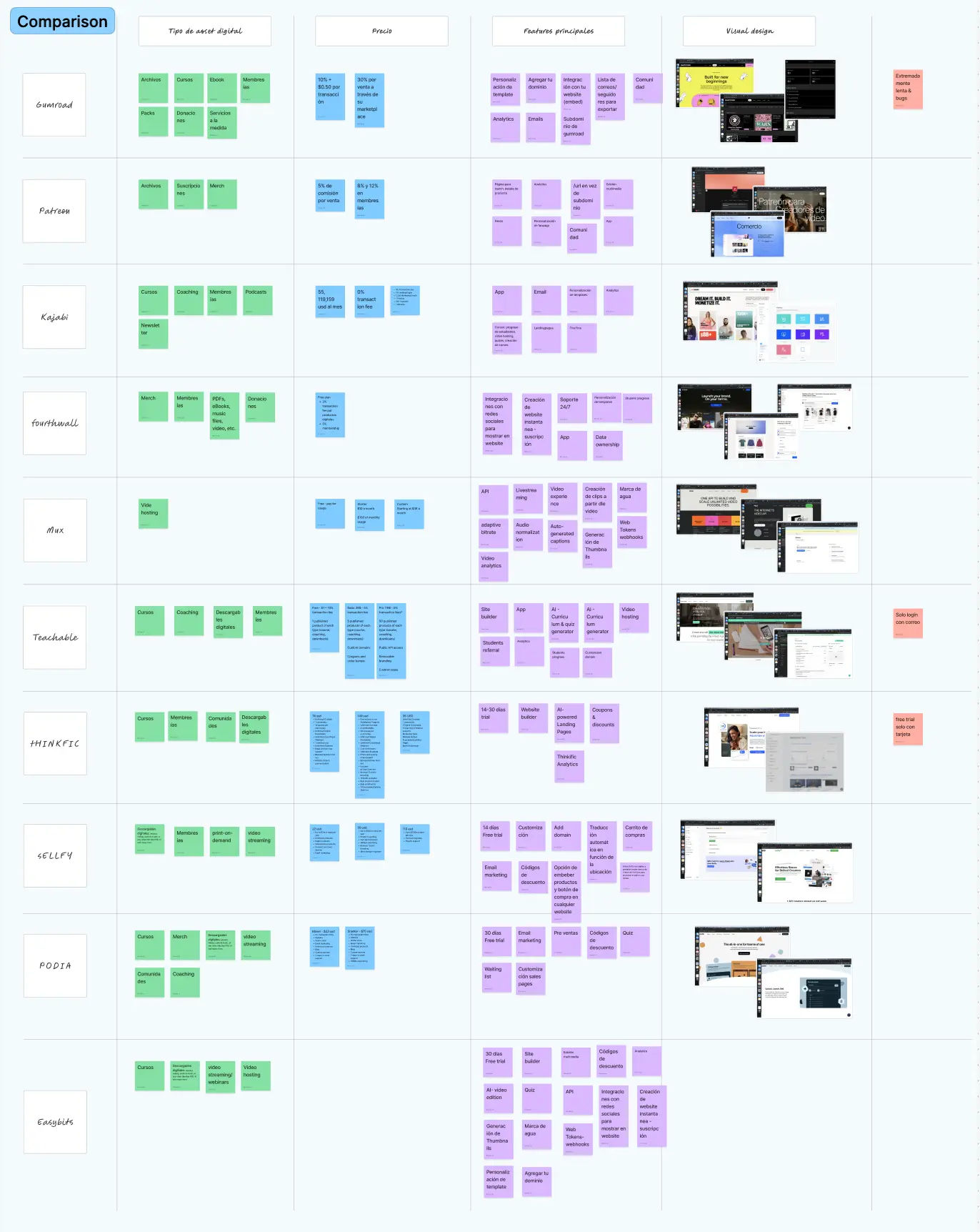
Guided by these questions and assumptions, we worked on a Benchmark to analyze and compare existing platforms in the market.
Personas
In addition, we carried out in-depth interviews with 20 participants to uncover key pain points and opportunities for improvement, helping us define clear actions to move forward. Based on both quantitative and qualitative user research we defined 3 user personas.
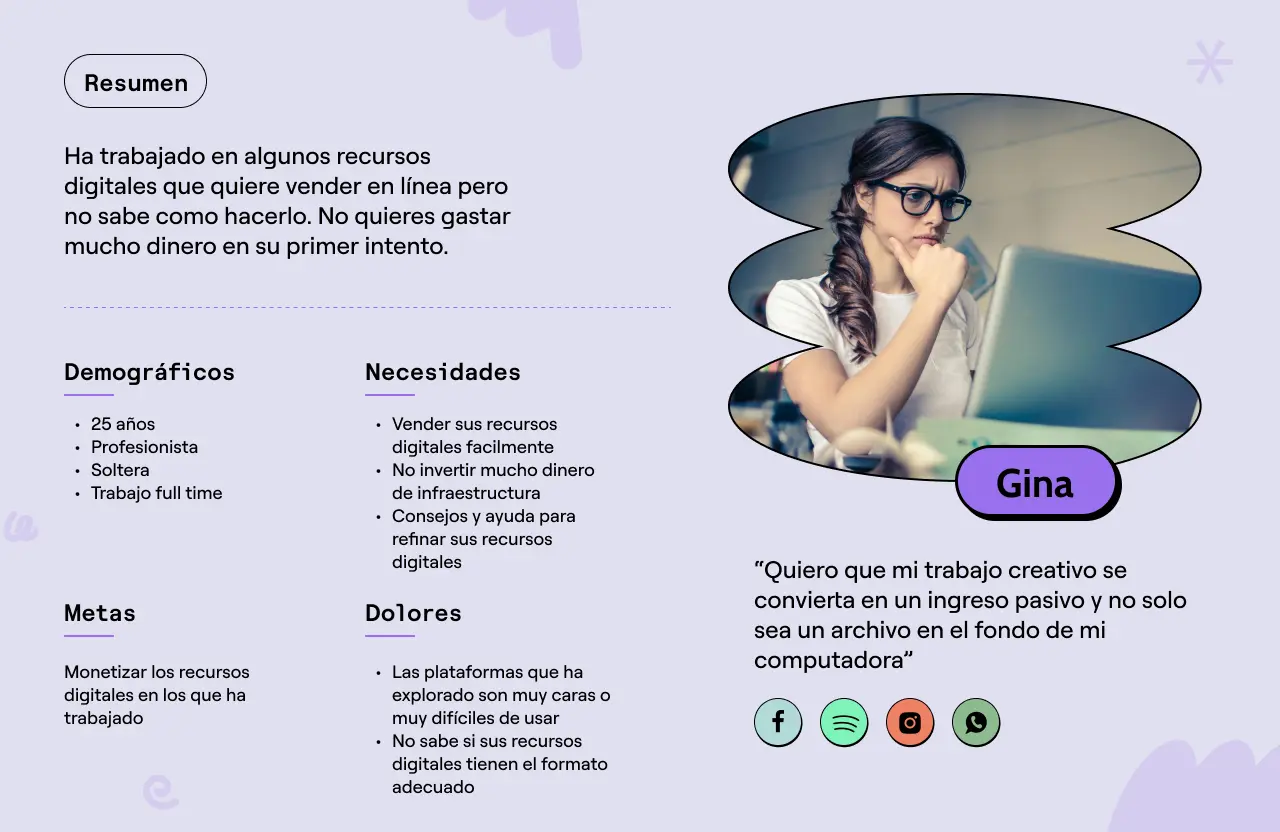
Gina: The beginner
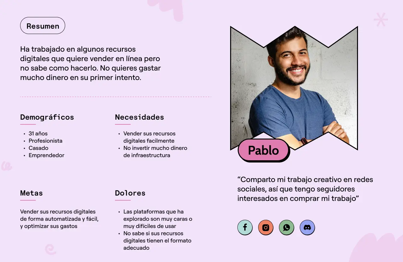
Pablo: The creative
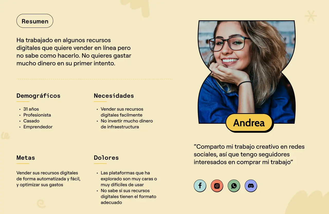
Andrea: The expert
What did data tell us?
Important findings to come out of this user testing:
- • 55% of users have tried a selling platform, but 82% of them either didn’t fully understand how to use it or felt it didn’t meet their needs.
- • 45% of users haven’t used any platform yet, but are interested in selling digital assets such as guides, illustrations, drawings, or courses.
- • Only 5% of users have actually sold something digitally
- • 70% of users have created digital resouces like guides, drawings and illustrations
- • 90% of users are unsure about how to sell digital assets.


Plan of Action
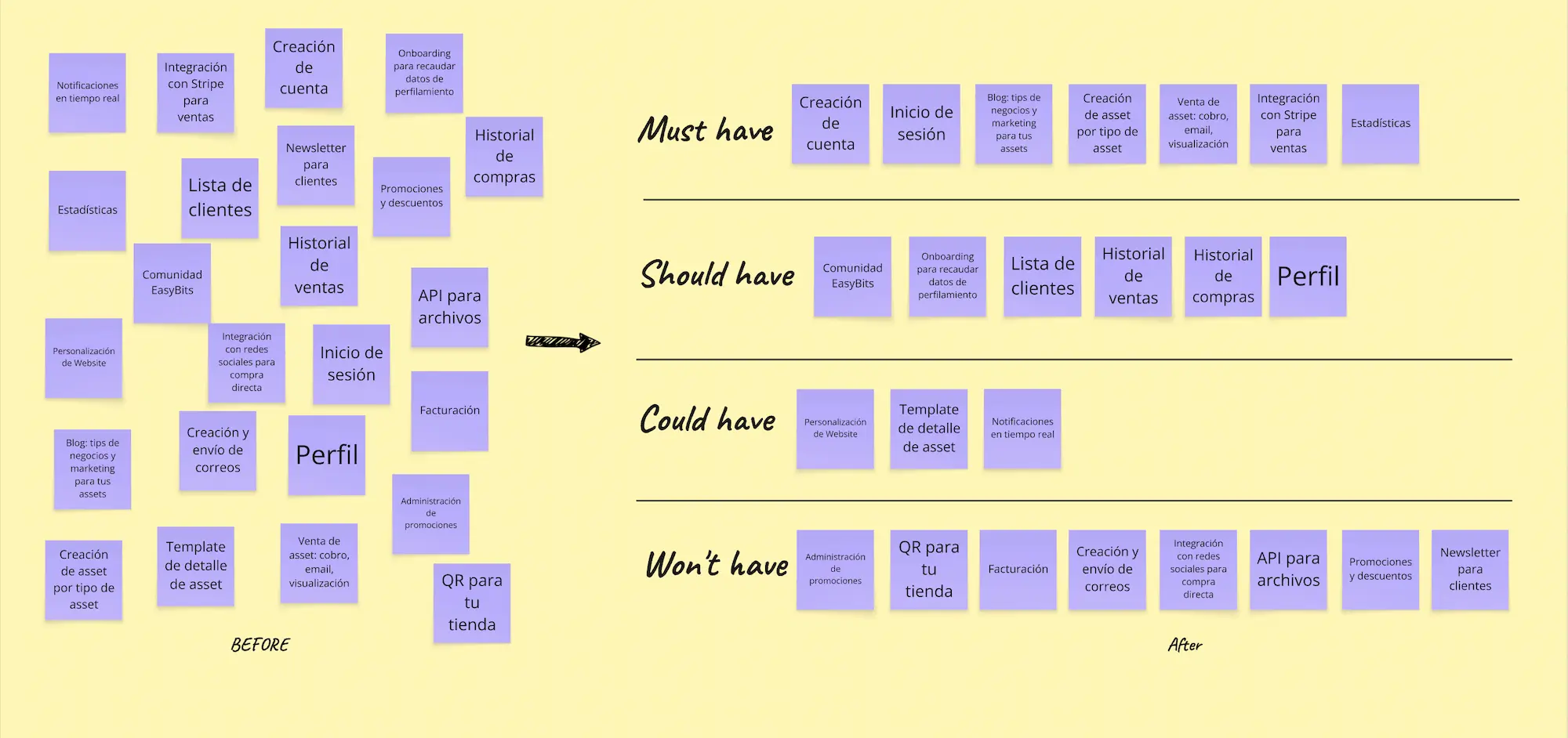
With all of this in mind, the challenges and objectives centered around addressing the users’ key needs. The design and product teams came together to brainstorm ideas and propose solutions for our main challenge: how to create a tool that enables users to sell different types of digital products from start to finish.
After evaluating our ideas, considering technical constraints, bearing in mind business requeriments and aligning on the kind of user experience we wanted to deliver, we prioritized the minimum set of features needed to offer a true end-to-end experience:
Ideation
Ideation phase was based on the architecture information definition before starting with the high fidelity to after come back to work on the user flows:
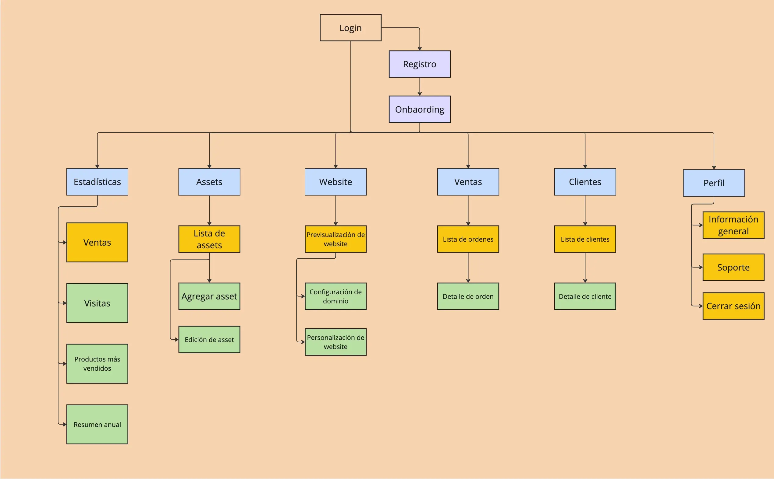
Site Map
I defined the hierarchical structure of the platform with the help of a card sorting session.
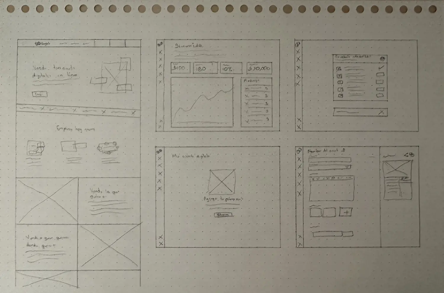
User Flow: A sketching session
I explored different proposals and conduct a deeper analysis of the best ideas to choose one.
Design
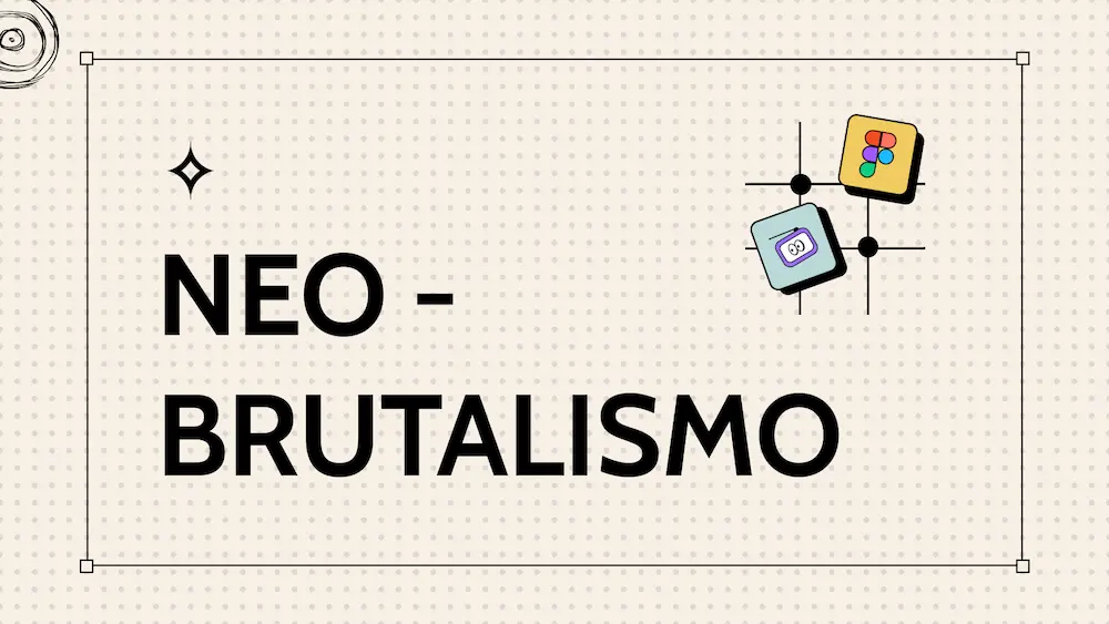
I moved on to high-fidelity wireframes, beginning with an exploration of different visual styles. Guided by the brand’s mission and values, the chosen direction was Neo-brutalism.
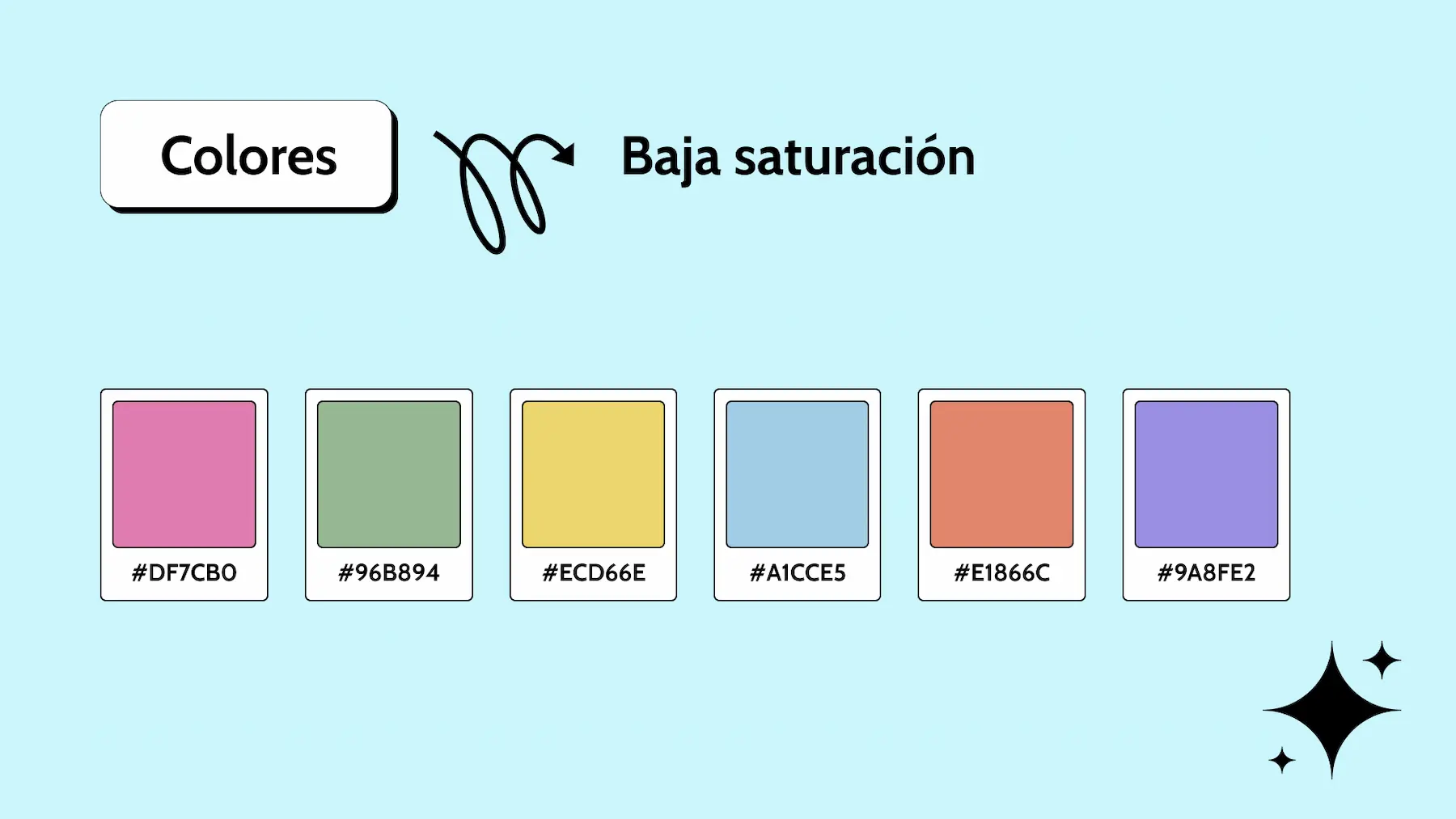
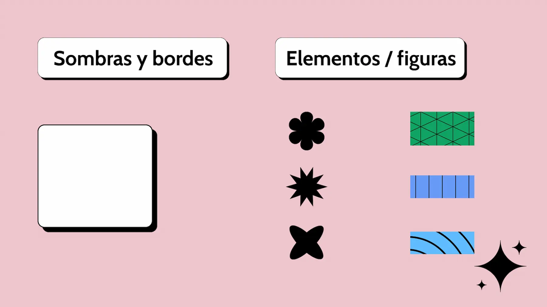
Taking into account the key traits of Neo-brutalist UI, I chose using a pastel color palette, solid shadows, geometric shapes, thick borders, and a clean sans-serif typeface to bring the look to life.
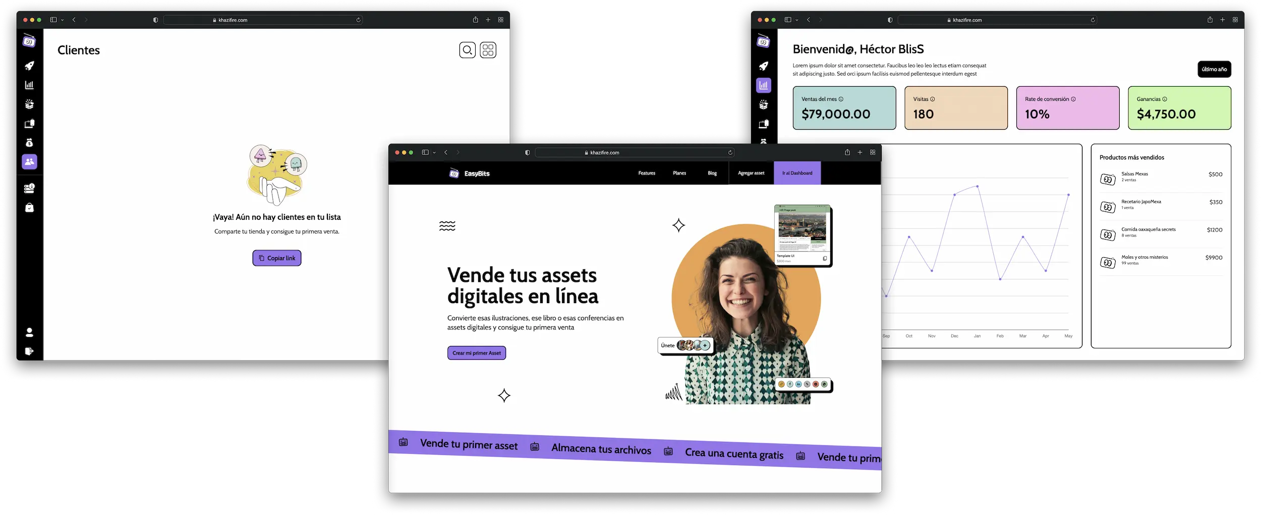
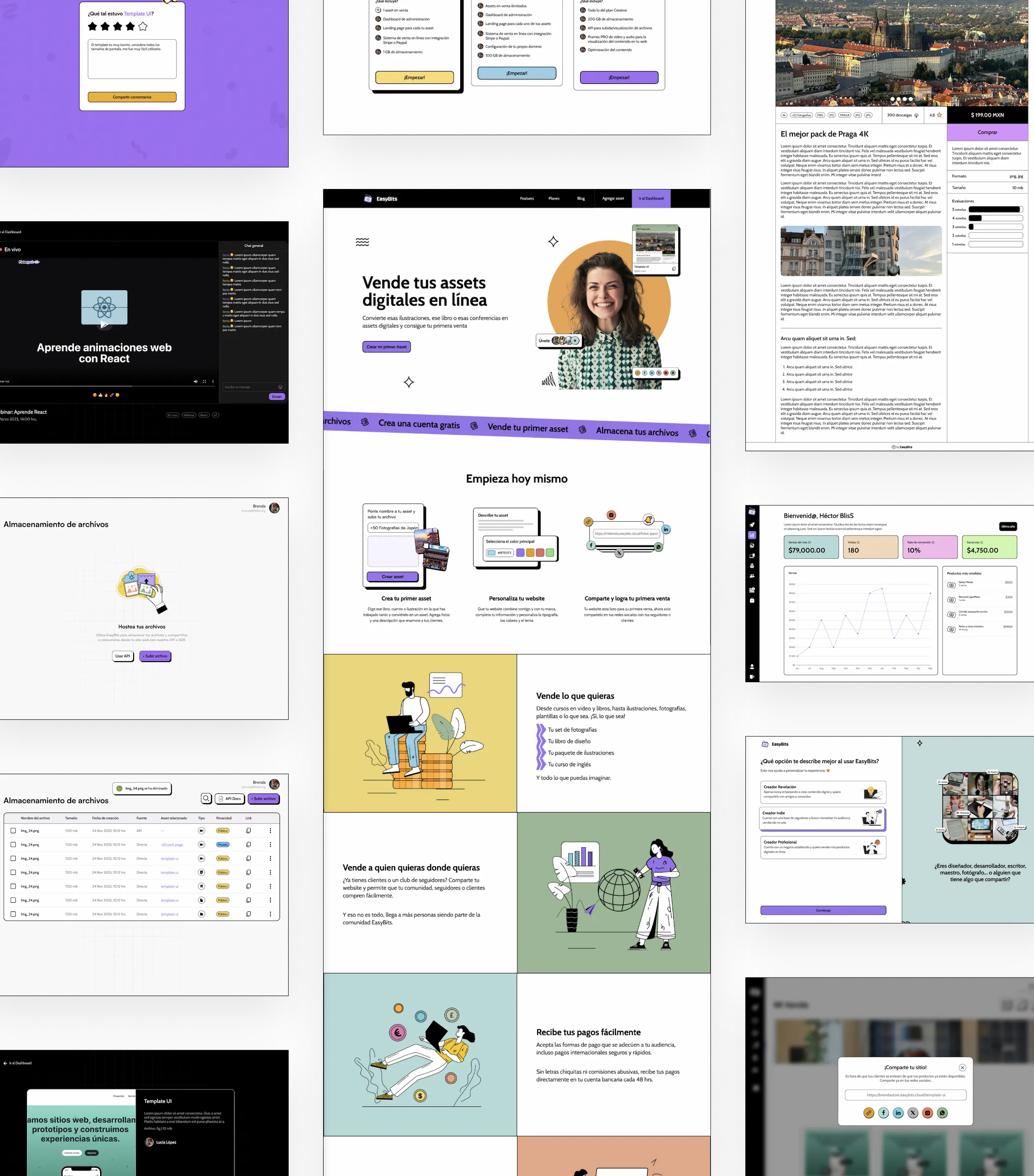
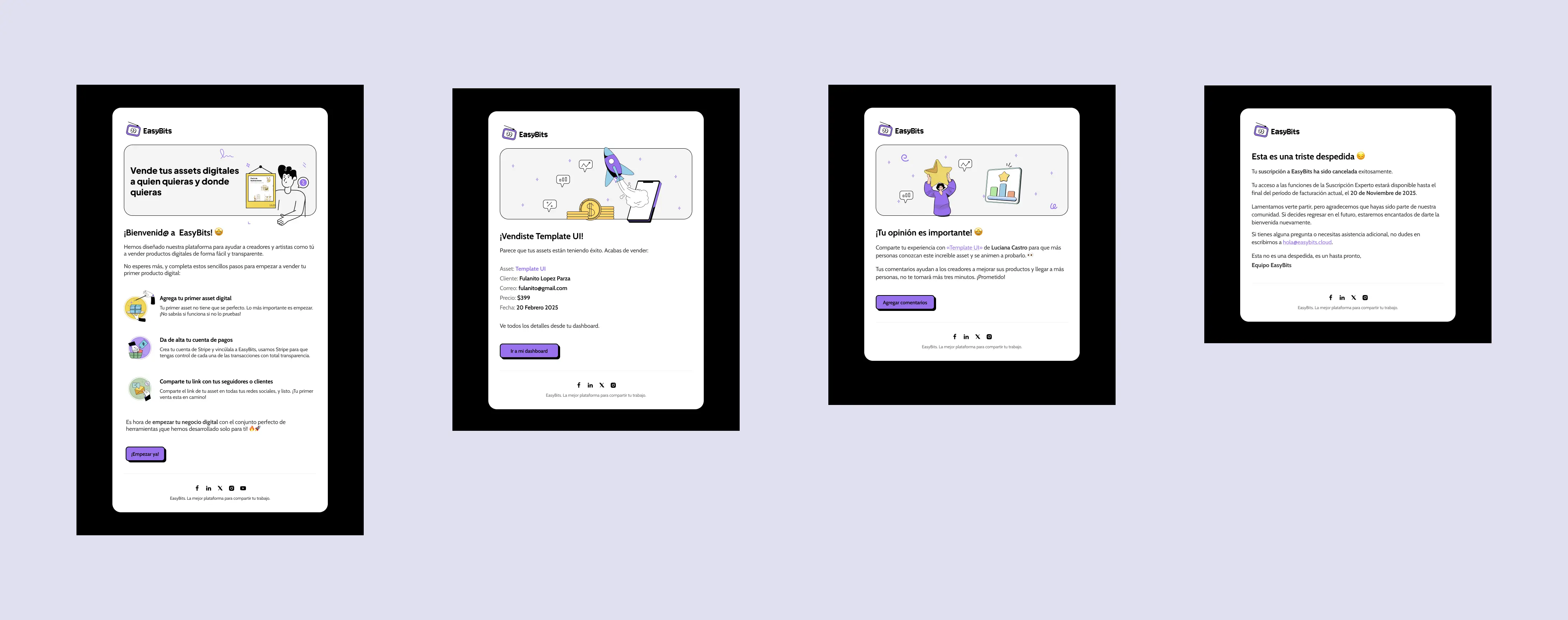
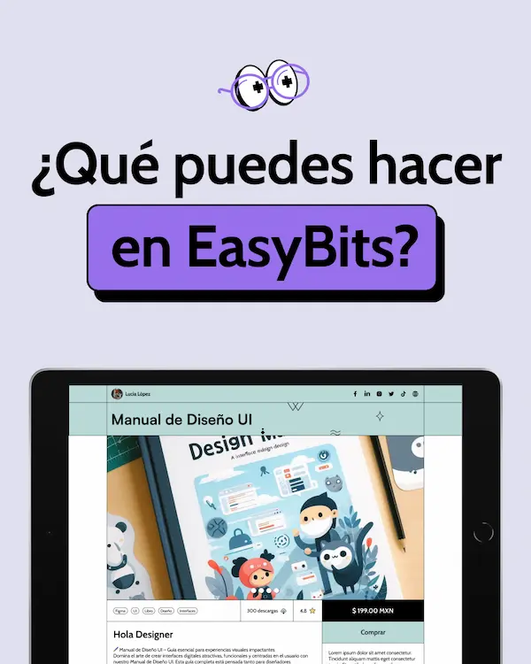
After getting approval on the visual style through a moodboard, I created the style guide and began designing the user flows in high fidelity, including both happy and unhappy paths, illustrations, and emails. After a few weeks of work, this was the resulting UI proposal:
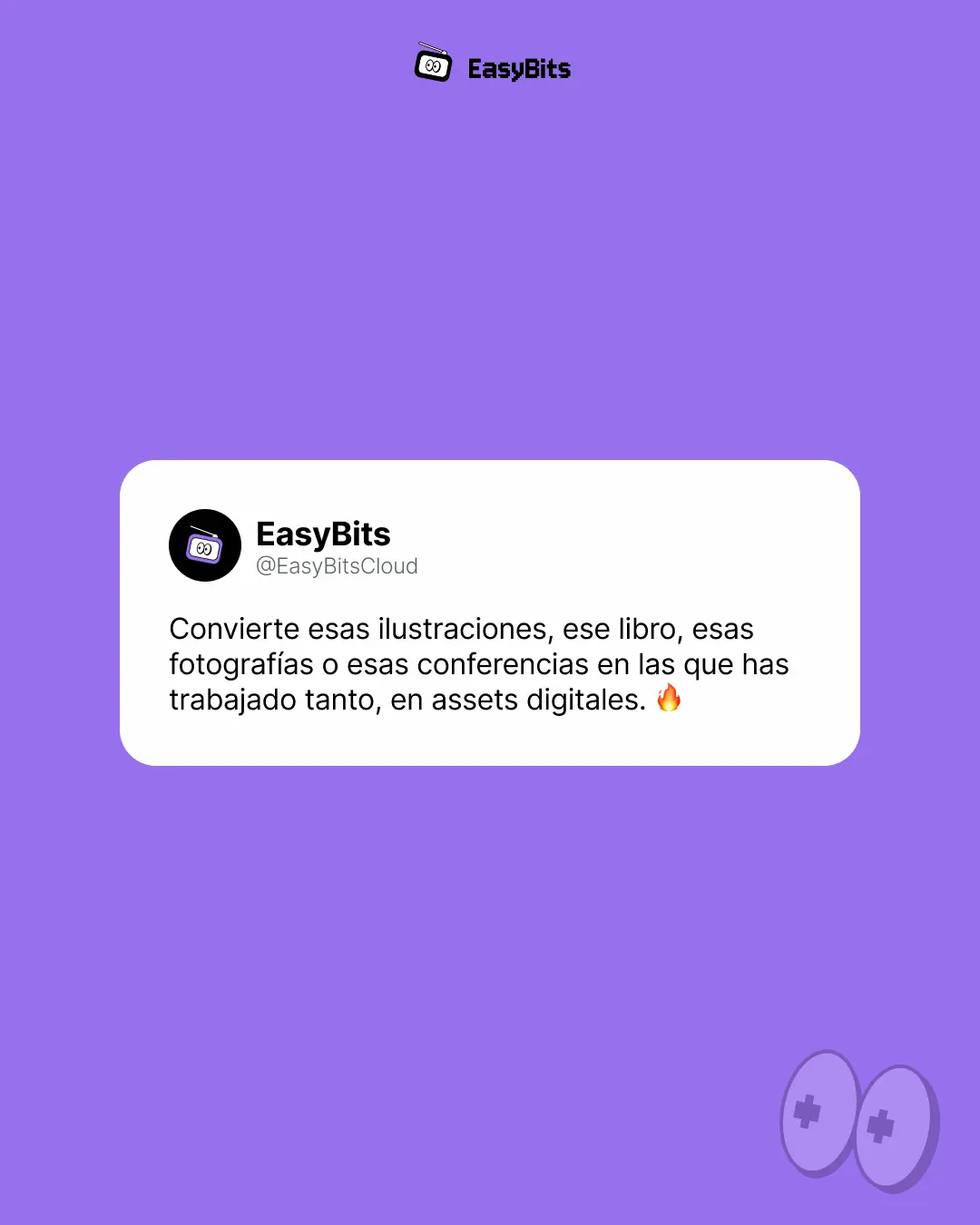
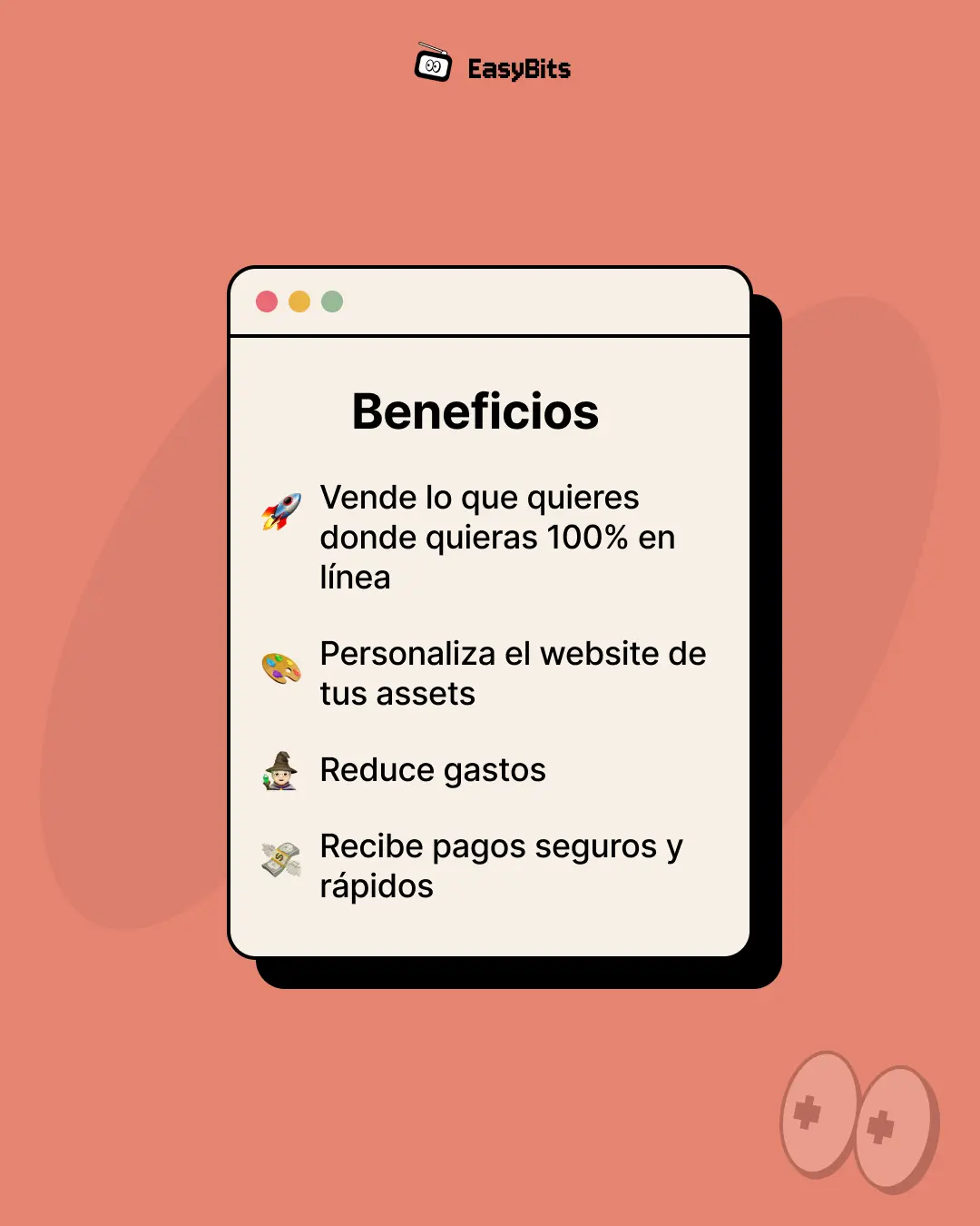
Additionally, I created social media post templates to ensure visual consistency across various communication channels, including the following examples:
Measuring Success & Next steps
The next step is the beta launch. We've implemented Google Analytics and Hotjar to track user behavior and analyze their journey through the platform, helping us identify pain points and areas for improvement in the next iteration cycle. The launch is scheduled for July 2025.

b
a
c
k
*
t
o
*
t
h
e
*
t
o
p
*